Permissions
See Using RBAC for more information.
Create a Resource Tile
From Dashboard > Dashboard 2.0, create a new dashboard or select from an existing dashboard collection.
See Create Dashboards to learn about creating dashboards.
Click CREATE TILE or + from the toolbar.
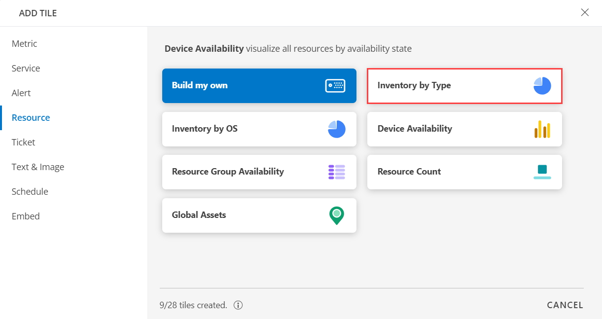
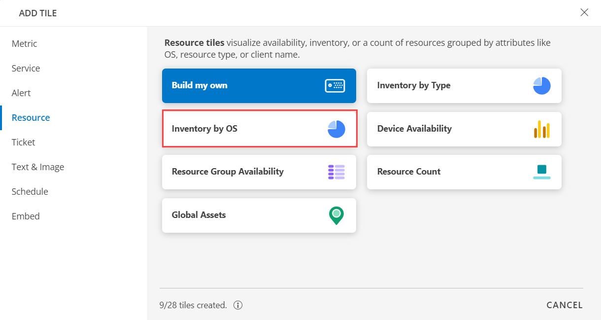
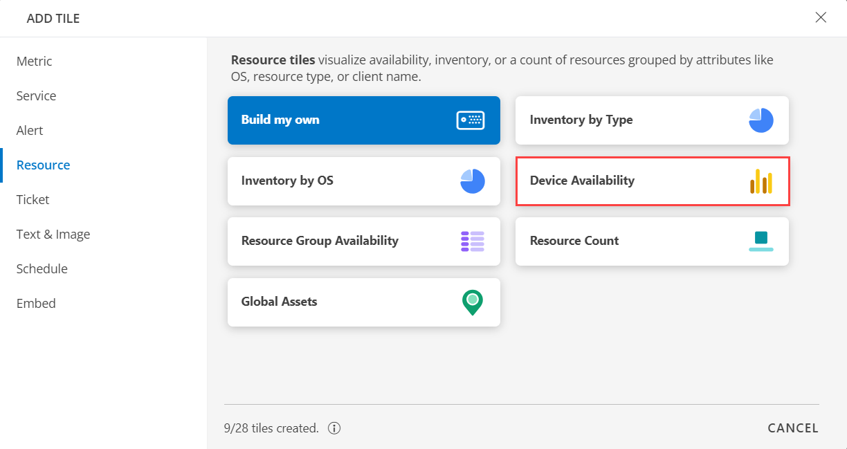
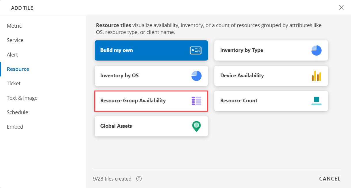
In the ADD TILE screen that appears, select RESOURCE.

Select one of the following:
Tile Option Functionality Build my own Visualize availability, inventory, or a count of resources grouped by attributes like OS, resource type, or client name. Inventory by Type Visualize all resources by resource type. Inventory by OS Visualize all resources by OS. Device Availability Visualize all resources by availability state. Resource Group Availability Visualize all resources in resource group by availability state. Resource Count Visualize count of resources of a given Resource Type. Global Assets Visualize inventory across the geography. The configured tile will now appear on the dashboard. In the visualization, you have the option to sort the resources based on the availability state: Up, Down, Unknown, Undefined, or Unmonitored.
Note
You can select a specific time zone for their time stamps by setting it up in My Profile.Build my own
Click here to view how to Build Your Own Query
- Select the Build my own tab. This enables you to create a custom tile.

Click the + QUERY and select the attributes from the drop-down list as you build the query. Click the + button to add additional attributes.
Note: You can combine multiple filters together to view only the required alerts. The query is completed and the results are displayed in the preview graph.
Alternatively, click </> to use the advanced query builder.
Note: Click </> again to close the advanced query field and switch back to the basic query builder format.Enter a query or click inside the box to see a list of OpsQL attributes.
Click the optional Legend icon and enter {{ in the EDIT LEGEND field to see a list of options.
Select the visualization from the following options:
| Chart Type | Description |
|---|---|
| Pie | Displays a pie chart. |
| Single Value | Displays a single value. |
| List | Displays values in a list format. |
| Bar | Displays the bar representation of the values. |
| Geo | Displays the geographical location of the resource. |
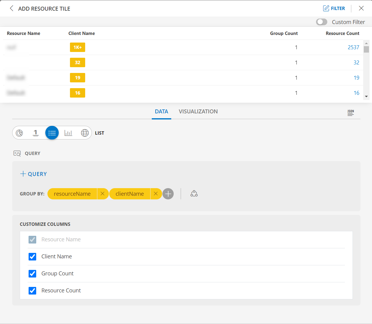
From the GROUP BY option, select an attribute. You can select up to two attributes.
Notes:
- In the List visualization, the second attribute values are displayed in a multi-column colored list.
- By default type is the attribute.
- If for a given state all the rows do not have any value (zero), the column will not be shown in the tile.
- You also have the option to edit the + Query and Attribute The following is a sample illustration of a multi-column list:
Enable the Split subgroups to view each grouping as a separate row.
Notes:- The multi-column list and split subgroup options are available for List chart only.
- The colors are displayed based on the default color categorization of alerts.
- Click the count or any column in the multi-column list to drill down and see the contextual list of alerts in the alerts browser.
See Visualization to know on how to customize the Resource Tile.
Click CREATE. The Resource tile is created and displayed on the main dashboard page.
Inventory by Type
Click here to view Inventory by Type
- Select the Inventory by Type tab. This enables you to create a custom tile.
Click the + QUERY and select the attributes from the drop-down list as you build the query. Click the + button to add additional attributes.
Note: You can combine multiple filters together to view only the required alerts. The query is completed and the results are displayed in the preview graph.
Alternatively, click </> to use the advanced query builder.
Note: Click </> again to close the advanced query field and switch back to the basic query builder format.Enter a query or click inside the box to see a list of OpsQL attributes.
Click the optional Legend icon and enter {{ in the EDIT LEGEND field to see a list of options.
Select the visualization from the following options:
| Chart Type | Description |
|---|---|
| Pie | Displays a pie chart. |
| Single Value | Displays a single value. |
| List | Displays values in a list format. |
| Bar | Displays the bar representation of the values |
| Geo | Displays the geographical location of the resource. |
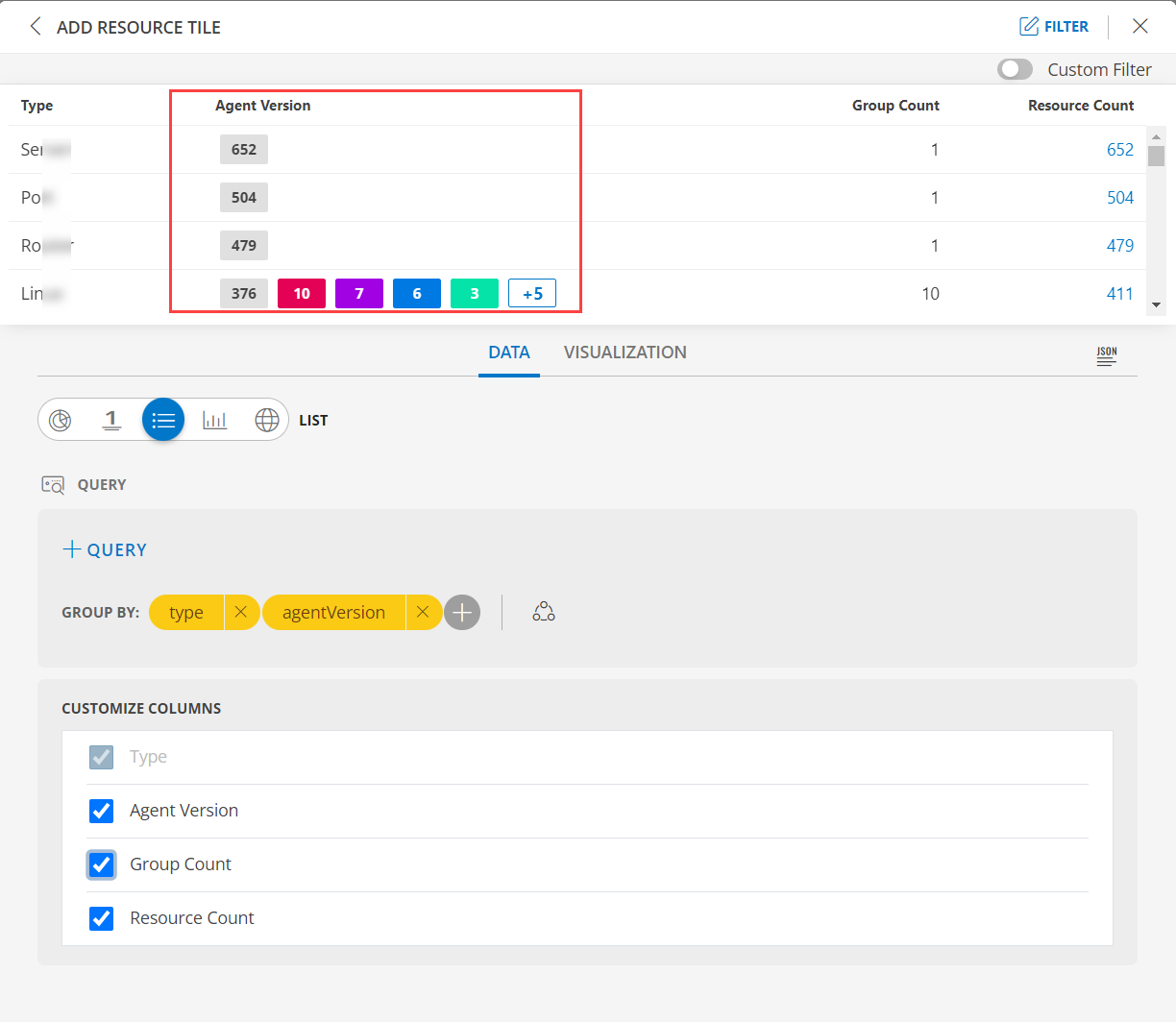
From the GROUP BY option, select an attribute. You can select up to two attributes.
Notes:
- In the List visualization, the second attribute values are displayed in a multi-column colored list.
- By default type the attribute.
- You also have the option to edit the + Query and Attribute The following is a sample illustration of a multi-column list:
Enable the Split subgroups to view each grouping as a separate row.
Notes:- The multi-column list and split subgroup options are available for List chart only.
- The colors are displayed based on the default color categorization of alerts.
- Click the count or any column in the multi-column list to drill down and see the contextual list of alerts in the alerts browser.
See Visualization to know on how to customize the Resource Tile.
Click CREATE. The Resource tile is created and displayed on the main dashboard page.
Inventory by OS
Click here to view Inventory by OS
- Select the Inventory by OS tab. This enables you to create a custom tile.
Click the + QUERY and select the attributes from the drop-down list as you build the query. Click the + button to add additional attributes.
Note: You can combine multiple filters together to view only the required alerts. The query is completed and the results are displayed in the preview graph.
Alternatively, click </> to use the advanced query builder.
Note: Click </> again to close the advanced query field and switch back to the basic query builder format.Enter a query or click inside the box to see a list of OpsQL attributes.
Click the optional Legend icon and enter {{ in the EDIT LEGEND field to see a list of options.
Select the visualization from the following options:
| Chart Type | Description |
|---|---|
| Pie | Displays a pie chart. |
| Single Value | Displays a single value. |
| List | Displays values in a list format. |
| Bar | Displays the bar representation of the values |
| Geo | Displays the geographical location of the resource. |
From the GROUP BY option, select an attribute. You can select up to two attributes.
Notes:
- In the List visualization, the second attribute values are displayed in a multi-column colored list.
- By default os the attribute.
- You also have the option to edit the + Query and Attribute The following is a sample illustration of a multi-column list:
Enable the Split subgroups to view each grouping as a separate row.
Notes:- The multi-column list and split subgroup options are available for List chart only.
- The colors are displayed based on the default color categorization of alerts.
- Click the count or any column in the multi-column list to drill down and see the contextual list of alerts in the alerts browser.
See Visualization to know on how to customize the Resource Tile.
Click CREATE. The Resource tile is created and displayed on the main dashboard page.
Device Availability
Click here to view Device Availability
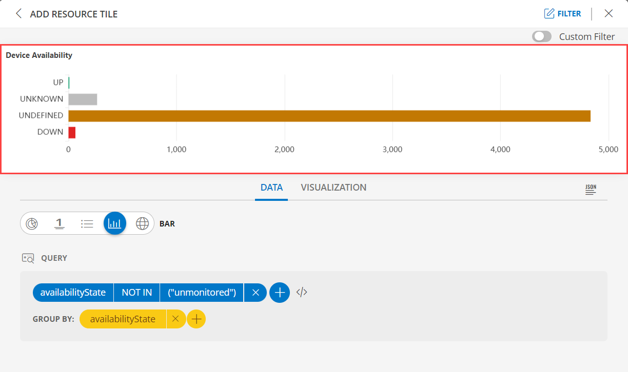
- Select the Device Availability tab. This enables you to create a custom tile.
Click the + QUERY and select the attributes from the drop-down list as you build the query. Click the + button to add additional attributes.
Notes:
- By default the OPSQL query is already generated. Below is the OpsQl:
availabilityState NOT IN ("unmonitored")- You can combine multiple filters together to view only the required alerts. The query is completed and the results are displayed in the preview graph.
Alternatively, click </> to use the advanced query builder.
Note: Click </> again to close the advanced query field and switch back to the basic query builder format.Enter a query or click inside the box to see a list of OpsQL attributes.
Click the optional Legend icon and enter {{ in the EDIT LEGEND field to see a list of options.
Select the visualization from the following options:
| Chart Type | Description |
|---|---|
| Pie | Displays a pie chart. |
| Single Value | Displays a single value. |
| List | Displays values in a list format. |
| Bar | Displays the bar representation of the values |
| Geo | Displays the geographical location of the resource. |
From the GROUP BY option, select an attribute. You can select up to two attributes.
Notes:
- In the List visualization, the second attribute values are displayed in a multi-column colored list.
- By default availabilityState is the attribute.
- You also have the option to edit the + Query and Attribute The following is a sample illustration of a multi-column list:
- See Visualization to know on how to customize the Resource Tile.
- Click CREATE. The Resource tile is created and displayed on the main dashboard page.
Resource Group Availability
Click here to view the Resource Group Availability
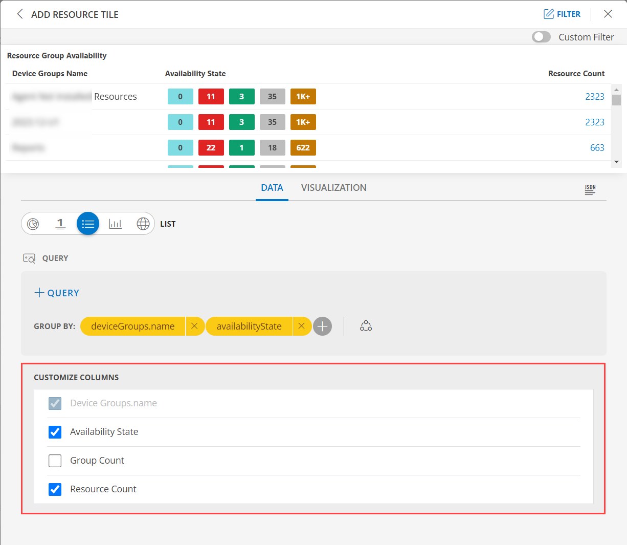
- Select the Resource Group Availability tab. This enables you to create a custom tile.
Click the + QUERY and select the attributes from the drop-down list as you build the query. Click the + button to add additional attributes.
Note:
- You can combine multiple filters together to view only the required alerts. The query is completed and the results are displayed in the preview graph.
Alternatively, click </> to use the advanced query builder.
Note: Click </> again to close the advanced query field and switch back to the basic query builder format.Enter a query or click inside the box to see a list of OpsQL attributes.
Click the optional Legend icon and enter {{ in the EDIT LEGEND field to see a list of options.
Select the visualization from the following options:
| Chart Type | Description |
|---|---|
| Pie | Displays a pie chart. |
| Single Value | Displays a single value. |
| List | Displays values in a list format. |
| Bar | Displays the bar representation of the values |
| Geo | Displays the geographical location of the resource. |
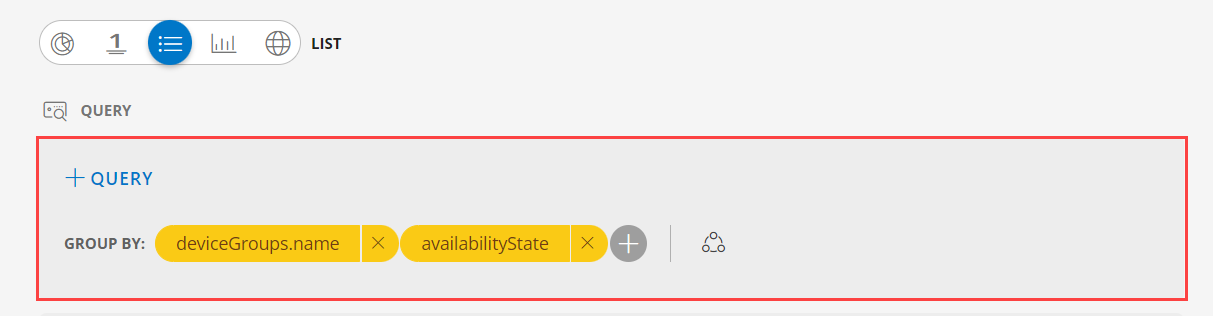
From the GROUP BY option, select an attribute. You can select up to two attributes.
Notes:
- In the List visualization, the second attribute values are displayed in a multi-column colored list.
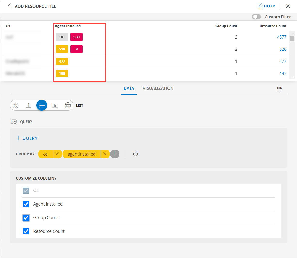
- By default deviceGroups.name and availabilityState is the attribute.
- You also have the option to edit the + Query and Attribute The following is a sample illustration of a multi-column list:
- In the CUSTOMIZE COLUMNS section, select the checkbox to display the information.
| Functionality | Description |
|---|---|
| Device Groups.name | Name of the device group Notes: By default Device Groups.name is checked and cannot be unchecked. |
| Availability State | Check the status of the resource. |
| Group Count | Group count information for resource. |
| Resource Count | View the resource count information for the resource. |
- See Visualization to know on how to customize the Resource Tile.
- Click CREATE. The Resource tile is created and displayed on the main dashboard page.
Resource Count
Click here to view the Resource Count
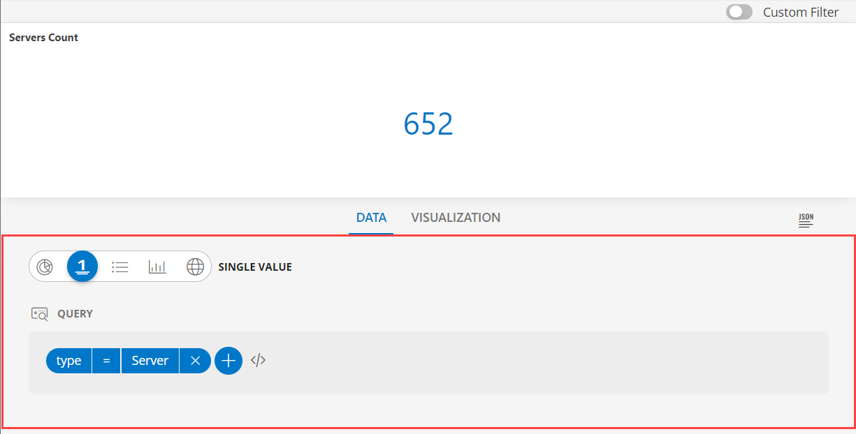
- Select the Resource Count tab. This enables you to create a custom tile.

- The default OPSQL query is already generated. Below is the OPSQL:
type = "Server"Note: You also have the option to edit the OPSQL.
- Alternatively, click </> to use the advanced query builder.
Note: Click </> again to close the advanced query field and switch back to the basic query builder format. - Enter a query or click inside the box to see a list of OpsQL attributes.
- Select the visualization from the following options:
| Chart Type | Description |
|---|---|
| Pie | Displays a pie chart. |
| Single Value | Displays a single value. |
| List | Displays values in a list format. |
| Bar | Displays the bar representation of the values |
| Geo | Displays the geographical location of the resource. |
- In the List visualization, the servers count is displayed. The following is a sample illustration of a multi-column list:
- See Visualization to know on how to customize the Resource Tile.
- Click CREATE. The Resource tile is created and displayed on the main dashboard page.
Global Assets
Click here to view the Global Assets
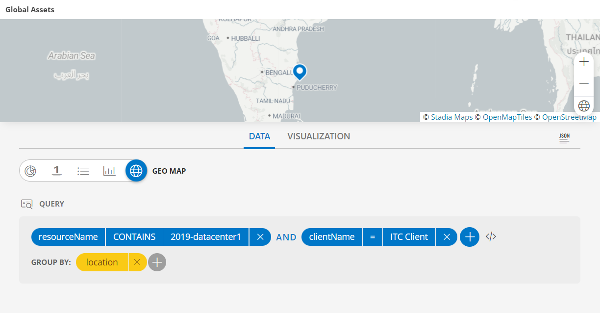
- Select the Global Assets tab. This enables you to create a custom tile.

Click the + QUERY and select the attributes from the drop-down list as you build the query. Click the + button to add additional attributes.
Note: You can combine multiple filters together to view only the required alerts. The query is completed and the results are displayed in the preview graph.
Alternatively, click </> to use the advanced query builder.
Note: Click </> again to close the advanced query field and switch back to the basic query builder format.Enter a query or click inside the box to see a list of OpsQL attributes.
Select the visualization from the following options:
| Chart Type | Description |
|---|---|
| Pie | Displays a pie chart. |
| Single Value | Displays a single value. |
| List | Displays values in a list format. |
| Bar | Displays the bar representation of the values |
| Geo | Displays the geographical location of the resource. |
From the GROUP BY option, select an attribute. You can select up to two attributes.
Notes:
- In the Geo visualization, the second attribute values are displayed in a multi-column colored list.
- By default location the attribute.
- You also have the option to edit the + Query and Attribute The following is a sample illustration of a multi-column list:
- See Visualization to know on how to customize the Resource Tile.
- Click CREATE. The Resource tile is created and displayed on the main dashboard page.
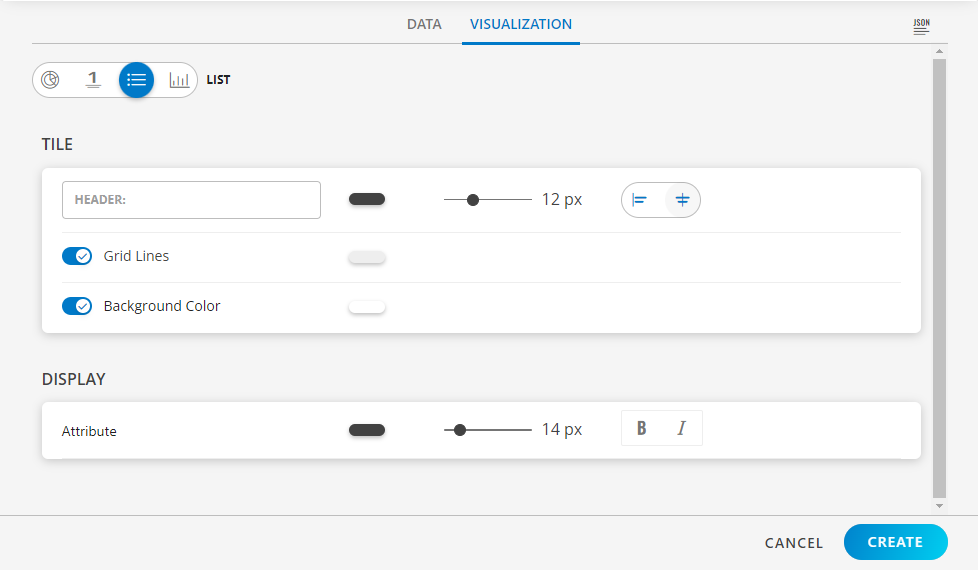
Visualization
- Click the Visualization tab to customize the visualization further:
- HEADER: Set a name, color, size, and alignment for the header.
- Grid Lines: Select the color of the grid lines, enable or disable the grid lines by clicking the toggle ON or OFF, Grid Lines option.
Note: By default the Grid Lines is enabled. - Background Color: Select the background color, enable or disable the background color by clicking the toggle ON or OFF background color.
Note: By default the Background Color is disabled. - Attribute: Select the color for the attribute, the size, bold or Italics.
Examples
The following are example illustrations for each visualization:
- See Value to view example illustrations for each visualization.
- See Line/Bar to view example illustrations for each visualization.
- See Pie to view example illustrations for each visualization.
- See Geomap to view example illustrations for each visualization.
- See List to view example illustrations for each visualization.